Heart of the City

Heart of the City


Heart of the City

The beloved Austin music non-profit, SIMS, throws their Heart of the City benefit concert each year. We were called on to help design collateral for this year’s theme: A Celebration of the Cosmic Cowboy. As one of their major fundraisers, this event brings some of Austin’s best musicians to a single stage for a full night of music and good vibes. Inspired by traditional country western showman suits, we ran with the theme and created a chainstitched and rhinestone-laden denim poster, which served as the basis for all other assets made.


SIMS_HOTC_02.jpg
candle.gif
SIMSS_Square_01.jpg
SIMSS_Square_03.jpg


Sure we could have made a cool screenprinted poster for this event. But to really respect the ‘Cosmic Cowboy’ vibes, we went all out and hired Ft. Lonesome, the best chain-stitchers in the land, to create a one-of-a-kind piece.


Screen Shot 2017-10-01 at 12.05.36 AM.png
Screen Shot 2017-10-13 at 12.36.11 PM.png
SIMS_HOTC_05.jpg
topper_bobbin.gif


There’s no matching the sound, soul and tactile quality of chunky thread being thrust into denim…


SIMS_HOTC_03.jpg
SIMS_HOTC_04.jpg
SIMSS_Square_04.jpg
SIMSS_Square_05.jpg


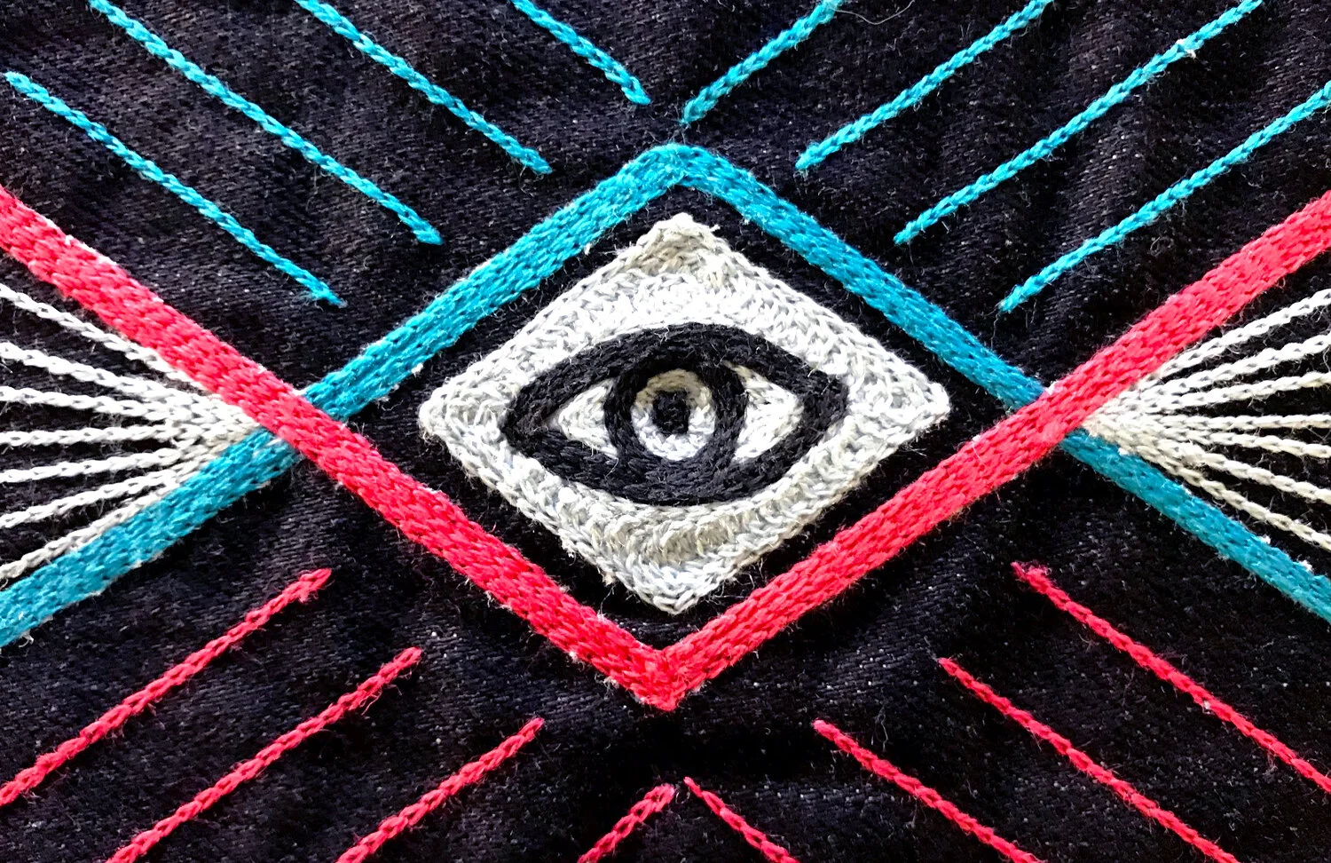
It all resulted in a heavy 18x24 denim poster that went up for auction at the event. All funds went towards the SIMS mission of supporting mental health amongst Austin’s musicians.


sims-heart-of-the-city-9b.jpg
 

Project Tasks: Print Design

© HOMESTEAD


TOMS Roasting Co.

TOMS Roasting Co.


TOMS Roasting Co.

With every bag of coffee you purchase, TOMS will provide one week of safe water for a person in need. Through a partnership with Water for People, TOMS is able to make sure they are giving back to the same communities providing the beans, helping to stimulate economic development as well.


But wait, TOMS makes coffee? We knew that would be the first question on every customer’s lips, so we addressed this right on the packaging. By designing a coffee bag that incorporates bold and provocative messaging, we re-assure coffee drinkers that if a scrappy start-up could do it once with shoes, it could do it again with some damn good coffee. This messaging was carried out through new TOMS Cafe retail stores, an informative website, graphic labeling system, t-shirts, video spots, and more.


An icon system inspired by the landmarks, cultures and patterns of each region was carried throughout the project - appearing on patches, shirts, labels, and other marketing materials.


A clean, crisp web portal was designed utilizing those same icons, allowing viewers to easily choose between learning more about the beans, or the ways in which TOMS gives back through each new product. 


TOMS Roasting Cafes can now be found in  Los Angeles, Austin, New York, & Chicago. They are a public commitment to community participation - serving as a space for education, volunteering and making friends - as well as a retail outlet for TOMS coffee & products. 


Giving is at the core of every  TOMS product. For the coffee launch, the film crew traveled to Rwanda to help explain the give by weaving together the stories of those involved: a coffee farmer, a young boy, and the founder of TOMS.


Project Tasks: Brand Identity, Packaging, Environment, Website

Made at TOMS


Lupulo New York

Lupulo New York


Lupulo New York

Lupulo is the second restaurant created by Michelin-star rated chef, George Mendes. Inspired by the famous cervejarias (breweries) of Lisbon, and designed to be an inviting New York neighborhood restaurant and bar, Lupulo offers a very relaxed and approachable atmosphere complemented by Mendes’ own inventive interpretations of traditional Portuguese food.


Working with Preacher, we were entrusted to develop the entire brand identity for Lupulo (which means “hops” in Portuguese), and started with a custom logotype and fiery, hop-feathered rooster mark. We then crafted everything from exterior signage to menus, business cards, beer growlers, coasters, t-shirts and more. Utilizing bold colors and subtle references of Portuguese design, we're happy to bring a bit of Lisbon to NYC.


A series of coasters was designed to help give guests some background on Portuguese culture, along with translations of their beautiful language.


Coaster_mockup_Horiz.jpg


Speaking of fiery birds, we created this little hot chicken as an homage to the open flame.


Project Tasks: Brand Identity, Print Design, Packaging

Made at Preacher with Taryn Kealani


Cuvée Cafe Mural

Cuvée Cafe Mural


Cuvée Cafe Mural

Cuvée Coffee is proudly based out of East Austin, where they serve up some of the best coffee on their side of the railroad tracks. Beer-lovers at heart, but coffee-addicts by nature, they have their own unique approach to coffee which we helped bring to life in their flagship cafe through a collaboration with Preacher and Ramona Press.


What started as a large, blank, 50-foot wall running the entire length of the cafe ended as a painted homage to all things that make East Austin such a unique community. Cuvée's intertwining of passions, a strong sense of Texas pride, and a little bit of 'weird' were all stitched together into one creative tapestry that now serves as a backdrop to one of the city's most eclectic and vibrant gathering spaces.


"Stopped into @cuveecoffee in Austin. Yes, owner @mikemckim is hella rad. Yes, the mural is huge and dope. Yes, ☕️ is 👍⭐️. Also, breakfast tacos on the way because, Texas."


- some cool cowboy on Instagram


Project Tasks: Mural Design, Illustration, Environment

Made at Preacher with Alex Roka


Cava Grill

Cava Grill


Cava Grill

Truly sweeping the nation, Cava Grill has rapidly expanded from their home base of Washington, D.C. to over 30 locations (and counting) across the states. Started by three childhood friends, this “fast casual” restaurant celebrates the flavors of their families’ traditional Greek and Mediterranean cooking in a modern setting. Not only is the food is amazingly tasty and fresh, the company's commitment to supporting urban gardening, sourcing local ingredients and fostering healthy eating programs is the "tzatziki on the pita".


While working at Preacher, we partnered with Cava Grill to help tell their brand story as they began to extend their footprint into new markets. Developing visuals around a unique brand positioning with bold values and a clear voice, we landed on the consumer-rallying idea: “For Those Who Savor”. This was brought to life throughout their locations via posters, packaging, photography and collateral. This is a brand that truly savors life, and we aimed to convey this sentiment to all who walk through their doors.


To kick off the project, we re-designed Cava Grill's ridiculicious packaged spreads, and set the tone for the new brand aesthetic. 


Lively colors and honest foods led to a series of in-store posters made to promote the brand's mission. Using close-up photography of  ingredients and hands-on production techniques, the ethos of Cava Grill comes alive in vibrant artwork. 


For an added touch of storytelling, we worked with photographer Josh Goleman, whose signature raw, black-and-white approach was chosen to reflect the brand's originality and approach to business.


These elements all came together in our brand book. Designed to solidify Cava Grill's position in the minds of new employees and potential investors, it's a testament to a company that is simply doing things their own way.


We also had the opportunity to touch upon many of the brand's customer-facing assets. In-store displays, packaging, cups, napkins and swag were all updated to carry the spirit of Cava Grill forward.


Project Tasks: Art Direction, Environment, Packaging, Print Design

Made at Preacher


Casper Snooze Bar

Casper Snooze Bar


Casper Snooze Bar

The innovative online sleep company, Casper, needed help introducing new markets to their brand. Even with their amazing 100 night trial period, a mattress is just one of those things that people like to try in person before they buy. In a collaboration with Preacher and NA Collective, we helped develop a mobile pop-up experience that avoided the traditional 'mattress showroom' antics the brand has challenged since say one. And we named it after morning's best friend: The Snooze Bar. 


In this AM coffee bar / PM cocktail lounge, guests could book private naps on Casper mattresses in our custom-built canvas tents, or just drop by for live music, gourmet waffles and signature drinks. Design touches around the space gently lulled visitors into our world of slumber. This immersive pop-up experience traveled from D.C. to Austin and San Francisco, presenting Casper as a modern, thoughtful and desirable option for those who seek the best night's sleep. Because five more minutes in a Casper bed is a beautiful thing indeed...


Guests began their experience by checking in with our concierge, where they traded in their shoes for custom slippers and fresh pillowcases before being led to their private canvas napping tent.


A "Sleep Menu" containing curated playlists of dreamy songs and podcasts on the science of sleep - as well as a choice of dreamscapes projected onto the ceiling of the tent - ensured that our guests got to choose their perfect napping style.


To entertain guests before and after their nap, our cocktail bar served up signature drinks, coffee and gourmet waffles all day long. They also received copies of our Shuteye Journal, chock full of whimsical sleep-related short stories, poems and photography.  


The quiet, peaceful naptime setting transformed in the evening when the lights turned down, local jazz bands took the stage, and private canvas tents became (very comfortable) cocktail lounges.


Local artists in each city held court at the end of the bar and served as 'dream analysts' - sketching guest's dreams onto cocktail napkins as a memorable take-away. Nothing like a few drinks for people to open up about their deepest dreams and desires.


In the end, over 3,000 guests enjoyed a personalized nap experience at the Snooze Bar, while Casper saw a  21% increase of trial-to-sale conversions above their other previous events.


Social_01.jpg
Social_02.jpg
Social_03.jpg


" I walked in because I smelled the waffles from the street. I stayed for the amazing experience."


- a happy guest


Project Tasks: Art Direction, Environment, Styling, Print Design, Event

Made at Preacher


Knox Photographics

Knox Photographics


Knox Photographics

Austin photographer Courtney Knox knew that her existing logo was not keeping up with the expanding scope of her studio offerings. Seeking a classic and timeless style, we had the pleasure of working with Knoxy through many different logo solutions before settling on this sophisticated mark. Anchored by premium production techniques of letterpress, wax stamps, and dip dyed paper, her new stationary set conveys the same craft and attention to detail that she puts into her thoughtful photography.


Knox_horiz_09.jpg
Knox_horiz_13.jpg

© HOMESTEAD

Project Tasks: Brand Identity, Print Design


   TOMS "We Are One"

TOMS "We Are One"


TOMS We Are One
Campaign Photography

TOMS pioneered the movement of using business to do more good, and continues to support other organizations with the same mission. For their We Are One campaign, the iconic One for One company invited ten other philanthrophic game changers from around the globe to gather at Summit Powder Mountain in Eden, UT. It was a weekend of discussion, inspiration, and collaboration - not the typical fashion shoot. We jumped on board to help scout locations, style product, and make sure everyone felt at ease in front of the camera and throughout the weekend.


This mountain-top gathering of social change-makers called for impromptu photo sessions, capturing product during inspirational morning chats and golden hour conversation.


Project Tasks: Photo Production, Styling

Made at TOMS
Photography by Chris Ozer & John Arsenault


P.S. Snacks

P.S. Snacks


P.S. Snacks

Nikki Azzara approached us with her existing brand, Slender Seven, originally a blog for healthy recipes using seven ingredients or less. As her clean-eating-minded following grew, she also began packaging and selling tasty eggless cookie dough that was - surprise! - made with chickpeas.

Her current branding no longer fit the new direction: to take these deliciously indulgent, but healthy, snacks to the next level with an updated logo, packaging and website design. First, she needed a new name. A way to convey that this cookie dough was different - packed with protein and safe to eat raw. Through our first round of brainstorming, we focused on the healthy/vegan/raw aspect. Then finally realized we needed to simply let customers know straight up that they were being let in on a secret…P.S., this cookie dough is good for you.


PSsnacks_Horiz_10.jpg


Working with the wonderful Jennifer Cole in Asheville, we crafted a tasty photoshoot for the client's website and blog - showcasing different recipes featuring P.S. Snacks cookie dough.


Project Tasks: Naming, Brand Identity, Packaging, Photo Production

© HOMESTEAD


Squarespace + Leon Bridges

Squarespace + Leon Bridges


Squarespace + Leon Bridges

In a unique collaboration between Preacher, Squarespace and Leon Bridges, we worked with renowned photographer Danny Clinch to chronicle this musician's incredible rise to fame. We didn't have to try all that hard to show Leon’s humble approach to his newfound musical career. With Danny behind the lens, we captured all the soulful moments that make the man, and now get to share Leon's story through film and a beautiful site co-developed with the talented team over at Squarespace.


Pushing boundaries within the platform, and using this project to test new features for the mass market, we helped developed Leon's site from the ground up. Inspired by the use of white space found in liner notes of traditional vinyl records, our minimal page layout takes advantage of the beautiful platform provided by Squarespace. Holding a line between old and new, Leon's site is a testament to a man who is excited about where he's going, and thankful for where he's been.


Effortlessly cool and confident, we took cues from Leon's personality to create simple layouts with large type and minimal color.


"I want people to see an honesty within me. I'm not trying to be the next Sam Cooke or Otis Redding."


- Leon Bridges


Project Tasks: Art Direction, Website


Teva Footwear

Teva Footwear


Teva Footwear

Nearly 30 years ago, a Grand Canyon river guide forever changed the way people experienced the outdoors. Rigging two Velcro watchbands to an old pair of flip flops, he created a shoe that wouldn’t float away, and thus, the world’s first sport sandal. In doing so, he built a loyal tribe of river enthusiasts and athletes that has lasted for decades...


While working at Frank Creative, the focus of our GO. DO. BE. print campaign was to fully embrace the fluid moments of life and sport that one experiences during a river trip. We had Teva gather their team and set them loose down the Colorado River in the Grand Canyon. Through the use of photography, large-scale water polaroid transfers, and custom typography by notable poster artists, we were able create a liquid dream-scape that allows the amazing energy of the trip to flow right off the page.


The polaroid transfer process is pure magic, and separates the image into a jelly-like substance that can be freely manipulated underwater before placing it back onto a dry piece of paper.


Project Tasks: Art Direction, Print Design, Advertising


Parks Project

Parks Project


Parks Project

Our National Park system is losing money every day. This means fewer open trails and fewer rangers to teach the young. Parks Project was established as a way to re-inspire the public, encourage volunteerism, and give back to these natural wonders. Through sales of their apparel and accessories, funds are given to specific needs in parks all over the country. From bear boxes in Denali to erosion control in the Santa Monica Mountains, this team is fighting the good fight for mother nature.


Taking inspiration from trail signage and vintage park ledgers, we helped the fine folks at Parks Project craft a brand rooted in tradition, yet well-paced for today's aesthetic. We were responsible for all branding and collateral work: logo development, hangtags, website, catalog, patches, apparel design - and we're continually working to keep the brand moving forward through new products, graphics and initiatives.


"There is a love of wild nature in everybody, an ancient mother-love ever showing itself whether recognized or no, and however covered by cares and duties."

- John Muir


Extending their relationships with customers (and Mother Earth) even further, the team at Parks Projects hosts volunteer days at parks all across the country - encouraging people to get their hands dirty for a worthy cause. 


We also had the pleasure of working with our friend and videographer, Ryan Maxey, as he spent some quality time with our National Parks, making new friends and capturing footage along the way.


Project Tasks: Brand Identity, Art Direction, Packaging, Apparel, Website

© HOMESTEAD


Black & Blue Mural

Black & Blue Mural


Black & Blue Mural

To announce the launch of their highly-anticipated canned and nitrogenated cold brew, Cuveé Coffee commissioned a large mural along a heavily-traveled stretch of interstate through downtown Austin, TX. Playing off their iconic can graphics, we designed a piece that humorously extrapolated their packaging concept. Cuveé cold brew packs a punch, and that's exactly what this mural delivers - all 140 feet of it. Working with Preacher and Showgoat Murals, we braved the brutal Texas sun and transformed this neglected blank wall into a memorable expression of the Cuveé brand. With various smaller events held throughout the painting process, it all led up to a block party dedicated to the completion of the mural and their zinger of a new product. Ka-Pow.


Multiple teams worked in shifts, both day and night, to cover this huge wall with paint. The night guys had it good. Daytime temps were over 100 degrees in the sun. 


We coordinated a block party to celebrate the completion of the mural with a tasting party for the new cold brew, as well as a 'Black & Bluegrass' jam with local musicians. 


Project Tasks: Mural Design, Illustration, Event

Made at Preacher with Alex Roka


Live at 9:30

Live at 9:30


Live at 9:30

The 9:30 Club in Washington, DC is often heralded as one of the greatest American rock-n-roll venues still in existence. Founded in 1980, everyone from the Bad Brains to Bob Dylan have graced the stage, and we were honored to help add another chapter to the legacy of this long-standing musical establishment. Live at 9:30 is modern-day music variety show that is filmed on location and airs on PBS. Billed as giving viewers the best seat in the house, the club installed over 20 cameras around the venue - even on the necks of guitars - all piped into television sets around the country.


While at Preacher, we developed the Live at 9:30 identity to be used across the show's opening, site and merchandise. Most significantly, we designed and launched its online home, liveat930.com. As music lovers ourselves, we wanted to reference the rich history of concert posters made for this venue over the years, and let that inspiration shape the website. By bringing posters to life online, we could weave in and out of the print to reveal episode information, watch videos, learn about band lineups, and more. Squarespace provided the technology and sponsorship support - leveraging their platform as the ideal place to present creative content and bend the rules toward the unexpected. 


Working with developers at Squarespace, we created a coded template of different shapes and colors, allowing content from each episode to be seamlessly loaded onto the site…and essentially bringing gig posters to life in the digital space.


Each episode features multiple musical acts, as well as thoughtful interviews, comedic skits and more. A robust system of menus and visual cues help lead the viewer to the content they want to watch.


Made at Preacher with Taryn Kealani

Project Tasks: Brand Identity, Art Direction, Website


Logo Work

Logo Work


Following in the footsteps of our cattle-driving forefathers, we too make lasting marks that denote ownership of goods. The times, they may have changed, but the need for a quality brand mark will never go out of style. So we present to you some of the logos we've created for good folks over the years. Some are corporate brands, some are t-shirt designs, others are simply small creative steps in a long line of larger brand deployment. But they've all helped carry the message along at some point in the journey. Happy trails, ya'll!


This Bar Saves Lives

This Bar Saves Lives


This Bar Saves Lives

For every bar purchased, This Bar Saves Lives gives a packet of life-saving food to malnourished children in need. After seeing our work with TOMS, the team's marketing director looked to Homestead for direction on how to create elevated imagery as they prepared to launch their social good snack bars in both Target and Starbucks.


Using bright background colors, highlighting wholesome ingredients, and featuring the actual product they distribute in Africa (Plumpy Nut - it's a game changer - check it out), we captured the many sides of This Bar, while staying true to their mission: We Eat Together. Working with photographer Dunja Dumanski at Small Green Door in Los Angeles, we were able to capture a large number of photos in a short day shoot, quickly swapping backgrounds and ingredients to compliment the product.


Using eye-catching color combinations and playful animation, our goal was to stop even  the quickest Instagram scroller in their tracks.


Project Tasks: Art Direction, Styling, Photo Production

© HOMESTEAD


TOMS 10 Year Anniversary

TOMS 10 Year Anniversary


TOMS 10 Year Anniversary Campaign Photography

Photography for TOMS 10 Year Anniversary catalog and digital marketing signified a shift for the One For One company. Past campaigns saw product shot while worn on a Giving Trip to a far off, foreign location. Employees and friends of the company wore new styles while they distributed shoes in Peru, observed sight-saving surgeries in India, and visited with Coffee growers in Rwanda. This imagery evoked a sense of wanderlust, true to the brand, but began to feel like new shoes and intimate giving moments were fighting for attention.

For the company's 10 Year celebration, product was instead shot a little closer to home (and more relatable) for many customers. This change allowed giving images and storytelling to shine on their own, clearly defining the different sides of the brand's "One For One" mission. We joined TOMS for a refreshing lifestyle shoot around the Los Angeles area, helping to showcase the seasons' beautiful new styles and thoughtful details, and highlighting the expansion of offerings far beyond the well-known Classic Alpargata.


On a warm spring day in the Santa Monica Mountains, TOMS combined their traditional free spirit attitude with a more refined sense of style.  This direction reflected a brand that is no longer a scrappy newcomer - it's clear they are all grown up. 


Project Tasks: Photo Production

Made at TOMS
Photography by Christina Holmes & John Whitledge


Seventh Flag Coffee Co.

Seventh Flag Coffee Co.


Seventh Flag Coffee Co.

Welcome to a new union of coffee lovers, colloquially known as “Our Country of Friends”. This Seventh Flag now flies proud over the Austin landscape - in deference to the six other flags that have claimed the state of Texas throughout history.


At its core, Seventh Flag is a local neighborhood shop. While at Preacher, we were tasked with making sure this was reflected through thoughtful decoration throughout the space. From hanging custom-made local artwork, to sourcing soulful thrift store pieces and even screen printing our own posters - we gave the space its own identity and friendly voice within the community. Photography of the humble details helped to promote Seventh Flag as a low-key place to linger with your new friends.


Modern interiors and minimal distractions were balanced by soulful touches throughout the space.


A series of screenprinted posters were made with a phrase that serves as an open invitation to all who find themselves in need of a cup of coffee and a friendly place of acceptance. 


Project Tasks: Print Design, Environment, Photography

Made at Preacher with Kapono Chung


Blair Crimmins

Blair Crimmins


Blair Crimmins & the Hookers

Blair Crimmins & the Hookers party like its 1929. Taking cues from Prohibition-era ragtime jazz, and possessing a healthy sense of debauchery, their live shows are a sight to behold. Blair and his "hookers" (a rotating cast of local musicians) are quickly becoming known for putting on some of the best stage performances in the Southeast.


On his recent album, "The Musical Stylings Of", we aimed to create a dark, yet classical mark for the band. Taking inspiration from art surrounding the king of ragtime, Scott Joplin, we crafted this twisted typographical logo treatment to play off the slightly-sinister undertones of his music. As for the album cover itself, we kept it simple and clandestine: just like having to knock three times on a back door for a sip of hooch.


A series of alternate graphics were designed for use on merchandise, press releases & various knick-knackery on the road.


Project Tasks: Brand Identity, Album Design, Merch

© Homestead


TOMS Marketplace

TOMS Marketplace


TOMS Marketplace

When TOMS started, they did something no one else was doing: giving away a pair of shoes for every pair they sold. A few years later, this extended into giving sight-saving operations for every pair of sunglasses sold. The arrival of TOMS Marketplace took the pattern a step further: they turned over part of their site, stores and marketing budget to companies that could technically be considered their competition. All for the idea that "this is bigger than us".


And so the TOMS Marketplace was born. A website with over 250 products by 37 altruistic brands, customers were able to shop in entirely new ways: sorting by the cause or region they want to support. Through this platform, TOMS willingly sacrificed sales of their own goods to promote the good that other brands are doing. With the belief that business can be used to improve lives, TOMS leveraged their fan base to expose its Marketplace brands to a larger audience.    


Working with Australian illustrator Alice Carroll, we created over 50 approachable portraits of Marketplace brand founders for use in their web bios and print advertising.


Wild postings, billboards and magazine ads were purchased for the first time in TOMS history - and TOMS gave the space away to other brands.


Studio photography was a chance to showcase the breadth of product now housed under one roof, all contributing to a greater good. We also wanted to highlight the craftsmanship of each brand's unique  products.


Pop-up shops were held in various TOMS locations, as well as at other events, venues and concerts. These experiences allowed the Marketplace to take on physical spaces and reach new audiences. 


Project Tasks: Art Direction, Website, Photo Production, Advertising

Made at TOMS