Viewing entries tagged
Brand Identity

TOMS Roasting Co.

TOMS Roasting Co.


TOMS Roasting Co.

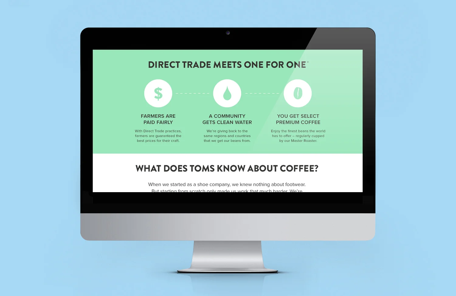
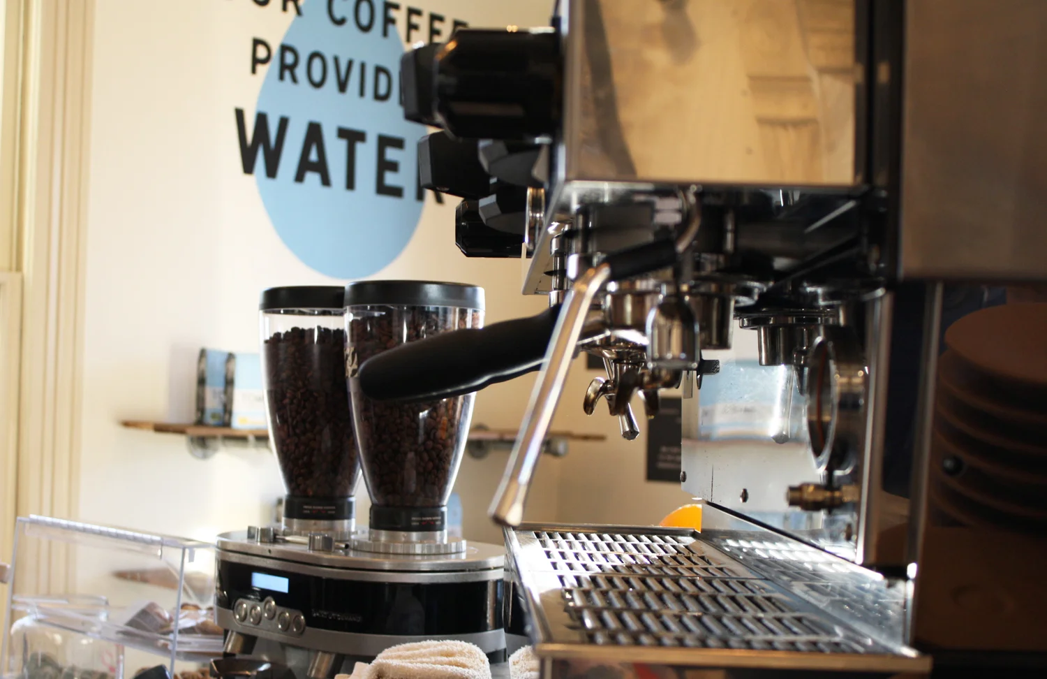
With every bag of coffee you purchase, TOMS will provide one week of safe water for a person in need. Through a partnership with Water for People, TOMS is able to make sure they are giving back to the same communities providing the beans, helping to stimulate economic development as well.


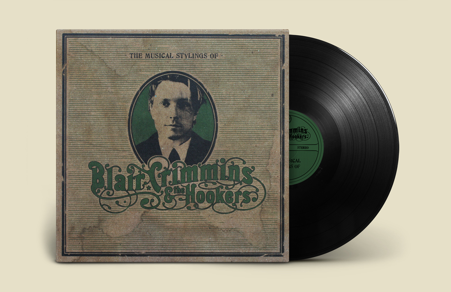
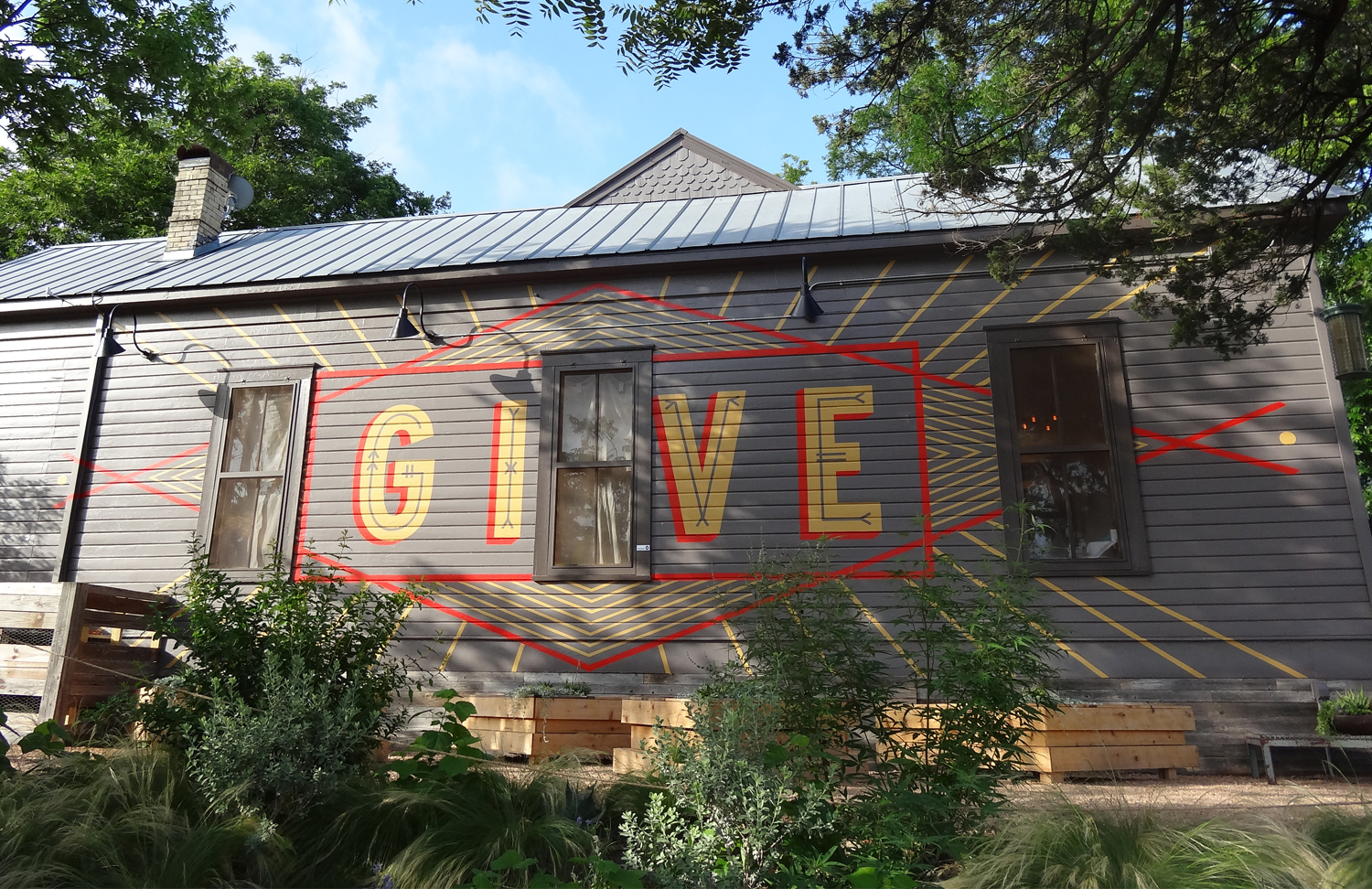
But wait, TOMS makes coffee? We knew that would be the first question on every customer’s lips, so we addressed this right on the packaging. By designing a coffee bag that incorporates bold and provocative messaging, we re-assure coffee drinkers that if a scrappy start-up could do it once with shoes, it could do it again with some damn good coffee. This messaging was carried out through new TOMS Cafe retail stores, an informative website, graphic labeling system, t-shirts, video spots, and more.


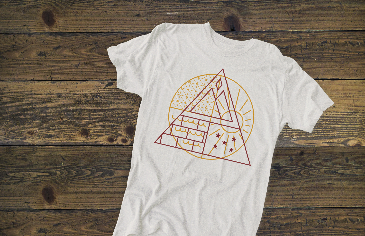
An icon system inspired by the landmarks, cultures and patterns of each region was carried throughout the project - appearing on patches, shirts, labels, and other marketing materials.


A clean, crisp web portal was designed utilizing those same icons, allowing viewers to easily choose between learning more about the beans, or the ways in which TOMS gives back through each new product. 


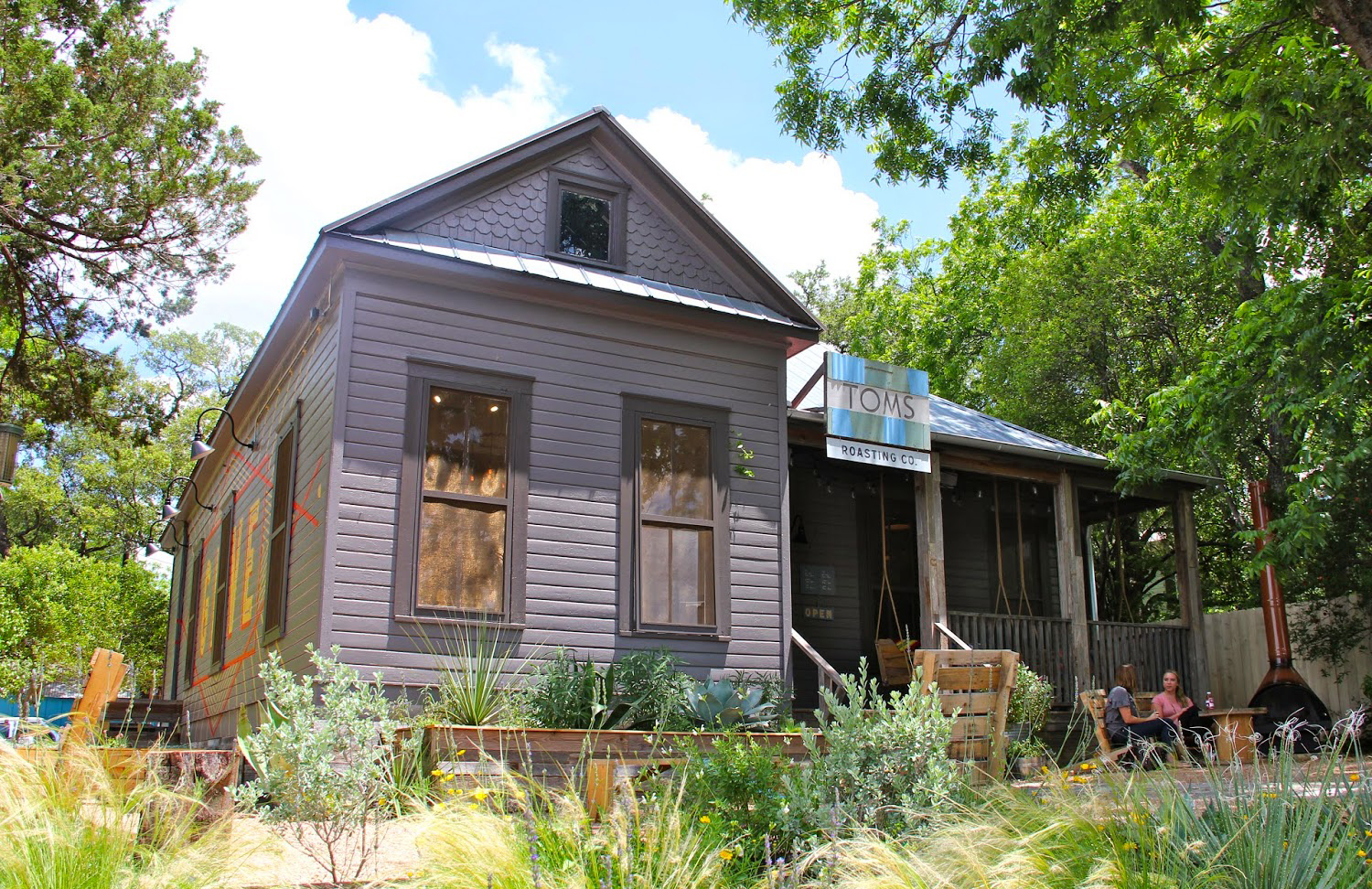
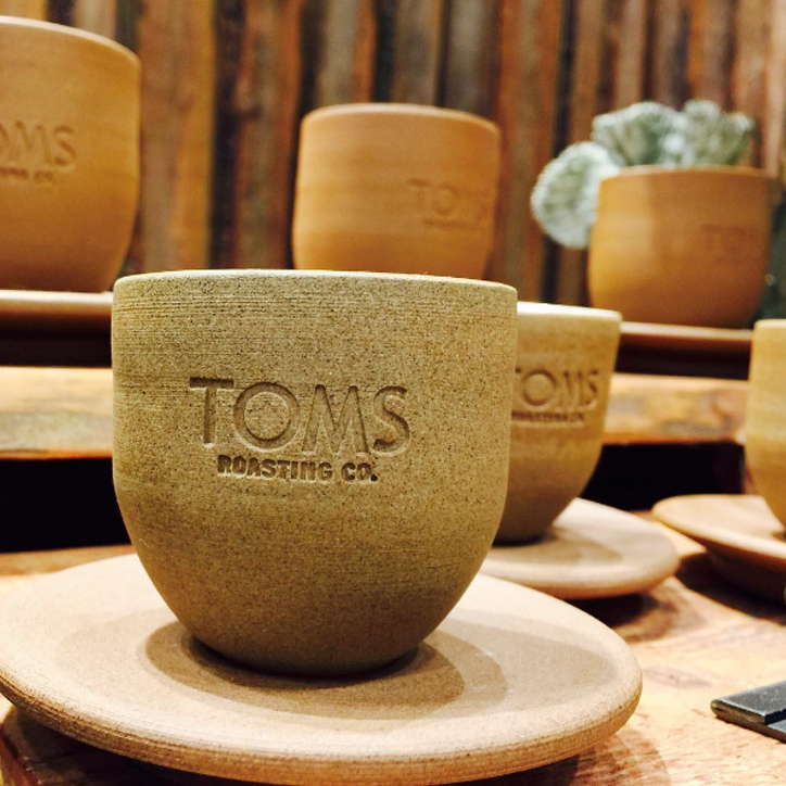
TOMS Roasting Cafes can now be found in  Los Angeles, Austin, New York, & Chicago. They are a public commitment to community participation - serving as a space for education, volunteering and making friends - as well as a retail outlet for TOMS coffee & products. 


Giving is at the core of every  TOMS product. For the coffee launch, the film crew traveled to Rwanda to help explain the give by weaving together the stories of those involved: a coffee farmer, a young boy, and the founder of TOMS.


Project Tasks: Brand Identity, Packaging, Environment, Website

Made at TOMS


Lupulo New York

Lupulo New York


Lupulo New York

Lupulo is the second restaurant created by Michelin-star rated chef, George Mendes. Inspired by the famous cervejarias (breweries) of Lisbon, and designed to be an inviting New York neighborhood restaurant and bar, Lupulo offers a very relaxed and approachable atmosphere complemented by Mendes’ own inventive interpretations of traditional Portuguese food.


Working with Preacher, we were entrusted to develop the entire brand identity for Lupulo (which means “hops” in Portuguese), and started with a custom logotype and fiery, hop-feathered rooster mark. We then crafted everything from exterior signage to menus, business cards, beer growlers, coasters, t-shirts and more. Utilizing bold colors and subtle references of Portuguese design, we're happy to bring a bit of Lisbon to NYC.


A series of coasters was designed to help give guests some background on Portuguese culture, along with translations of their beautiful language.


Coaster_mockup_Horiz.jpg


Speaking of fiery birds, we created this little hot chicken as an homage to the open flame.


Project Tasks: Brand Identity, Print Design, Packaging

Made at Preacher with Taryn Kealani


Knox Photographics

Knox Photographics


Knox Photographics

Austin photographer Courtney Knox knew that her existing logo was not keeping up with the expanding scope of her studio offerings. Seeking a classic and timeless style, we had the pleasure of working with Knoxy through many different logo solutions before settling on this sophisticated mark. Anchored by premium production techniques of letterpress, wax stamps, and dip dyed paper, her new stationary set conveys the same craft and attention to detail that she puts into her thoughtful photography.


Knox_horiz_09.jpg
Knox_horiz_13.jpg

© HOMESTEAD

Project Tasks: Brand Identity, Print Design


P.S. Snacks

P.S. Snacks


P.S. Snacks

Nikki Azzara approached us with her existing brand, Slender Seven, originally a blog for healthy recipes using seven ingredients or less. As her clean-eating-minded following grew, she also began packaging and selling tasty eggless cookie dough that was - surprise! - made with chickpeas.

Her current branding no longer fit the new direction: to take these deliciously indulgent, but healthy, snacks to the next level with an updated logo, packaging and website design. First, she needed a new name. A way to convey that this cookie dough was different - packed with protein and safe to eat raw. Through our first round of brainstorming, we focused on the healthy/vegan/raw aspect. Then finally realized we needed to simply let customers know straight up that they were being let in on a secret…P.S., this cookie dough is good for you.


PSsnacks_Horiz_10.jpg


Working with the wonderful Jennifer Cole in Asheville, we crafted a tasty photoshoot for the client's website and blog - showcasing different recipes featuring P.S. Snacks cookie dough.


Project Tasks: Naming, Brand Identity, Packaging, Photo Production

© HOMESTEAD


Parks Project

Parks Project


Parks Project

Our National Park system is losing money every day. This means fewer open trails and fewer rangers to teach the young. Parks Project was established as a way to re-inspire the public, encourage volunteerism, and give back to these natural wonders. Through sales of their apparel and accessories, funds are given to specific needs in parks all over the country. From bear boxes in Denali to erosion control in the Santa Monica Mountains, this team is fighting the good fight for mother nature.


Taking inspiration from trail signage and vintage park ledgers, we helped the fine folks at Parks Project craft a brand rooted in tradition, yet well-paced for today's aesthetic. We were responsible for all branding and collateral work: logo development, hangtags, website, catalog, patches, apparel design - and we're continually working to keep the brand moving forward through new products, graphics and initiatives.


"There is a love of wild nature in everybody, an ancient mother-love ever showing itself whether recognized or no, and however covered by cares and duties."

- John Muir


Extending their relationships with customers (and Mother Earth) even further, the team at Parks Projects hosts volunteer days at parks all across the country - encouraging people to get their hands dirty for a worthy cause. 


We also had the pleasure of working with our friend and videographer, Ryan Maxey, as he spent some quality time with our National Parks, making new friends and capturing footage along the way.


Project Tasks: Brand Identity, Art Direction, Packaging, Apparel, Website

© HOMESTEAD


Live at 9:30

Live at 9:30


Live at 9:30

The 9:30 Club in Washington, DC is often heralded as one of the greatest American rock-n-roll venues still in existence. Founded in 1980, everyone from the Bad Brains to Bob Dylan have graced the stage, and we were honored to help add another chapter to the legacy of this long-standing musical establishment. Live at 9:30 is modern-day music variety show that is filmed on location and airs on PBS. Billed as giving viewers the best seat in the house, the club installed over 20 cameras around the venue - even on the necks of guitars - all piped into television sets around the country.


While at Preacher, we developed the Live at 9:30 identity to be used across the show's opening, site and merchandise. Most significantly, we designed and launched its online home, liveat930.com. As music lovers ourselves, we wanted to reference the rich history of concert posters made for this venue over the years, and let that inspiration shape the website. By bringing posters to life online, we could weave in and out of the print to reveal episode information, watch videos, learn about band lineups, and more. Squarespace provided the technology and sponsorship support - leveraging their platform as the ideal place to present creative content and bend the rules toward the unexpected. 


Working with developers at Squarespace, we created a coded template of different shapes and colors, allowing content from each episode to be seamlessly loaded onto the site…and essentially bringing gig posters to life in the digital space.


Each episode features multiple musical acts, as well as thoughtful interviews, comedic skits and more. A robust system of menus and visual cues help lead the viewer to the content they want to watch.


Made at Preacher with Taryn Kealani

Project Tasks: Brand Identity, Art Direction, Website


Blair Crimmins

Blair Crimmins


Blair Crimmins & the Hookers

Blair Crimmins & the Hookers party like its 1929. Taking cues from Prohibition-era ragtime jazz, and possessing a healthy sense of debauchery, their live shows are a sight to behold. Blair and his "hookers" (a rotating cast of local musicians) are quickly becoming known for putting on some of the best stage performances in the Southeast.


On his recent album, "The Musical Stylings Of", we aimed to create a dark, yet classical mark for the band. Taking inspiration from art surrounding the king of ragtime, Scott Joplin, we crafted this twisted typographical logo treatment to play off the slightly-sinister undertones of his music. As for the album cover itself, we kept it simple and clandestine: just like having to knock three times on a back door for a sip of hooch.


A series of alternate graphics were designed for use on merchandise, press releases & various knick-knackery on the road.


Project Tasks: Brand Identity, Album Design, Merch

© Homestead